

A prospective customer can discover a business through search, an advert, a recommendation or a map listing. Once that person reaches the website, however, the decision changes. They are no longer asking only, “Does this business exist?” They are asking, “Can I trust it to solve my problem?”
Customer reviews can help answer that question, but simply dropping five stars into a footer is not enough. The source must be clear, the comments must feel relevant, the display must work on a phone, and the page still needs to load quickly. A useful review section is part evidence, part interface and part reputation-management process.
For businesses that want reviews to stay current without repeatedly copying them by hand, a Google reviews widget is one practical route: it can turn review data into a reusable website component while leaving the surrounding page focused on the customer’s decision. It is not the only method, though. Manual quotes, screenshots and custom API integrations all have situations in which they make sense.
This guide compares those four approaches, explains where reviews usually add the most value, and provides a framework for displaying them credibly on almost any website.
First, decide what the review display needs to do
“Show our reviews” sounds like a simple brief, but it can describe several different goals:
- Reassure a visitor: A compact rating and two relevant quotes near a booking or purchase action may be enough.
- Let people investigate: A larger review section with dates, names, sources and links supports deeper evaluation.
- Keep the website fresh: A synchronised feed reduces the work involved in replacing old testimonials.
- Support a particular claim: Reviews mentioning punctuality, product quality or aftercare can provide evidence beside the relevant service benefit.
- Collect more reviews: A link inviting verified customers to leave feedback is a separate feature from displaying existing reviews.
This distinction matters because the biggest review wall is not automatically the most persuasive solution. Someone choosing an emergency plumber may need quick reassurance beside the telephone number. Someone comparing a high-value professional service may want detailed experiences, recent dates and a way to check the original source.
Google says reviews can help a business stand out and provide useful information to prospective customers. Its Business Profile guidance also recommends valuing honest, balanced feedback and replying in a way that is professional, relevant and conversational. Those principles apply on the business’s own website too: the display should make the evidence easier to assess, not strip it of context.
Four ways to display Google reviews on a website
There is no universal best method. The right choice depends on how often reviews change, how much design control is needed, what the website platform permits and who will maintain the integration.
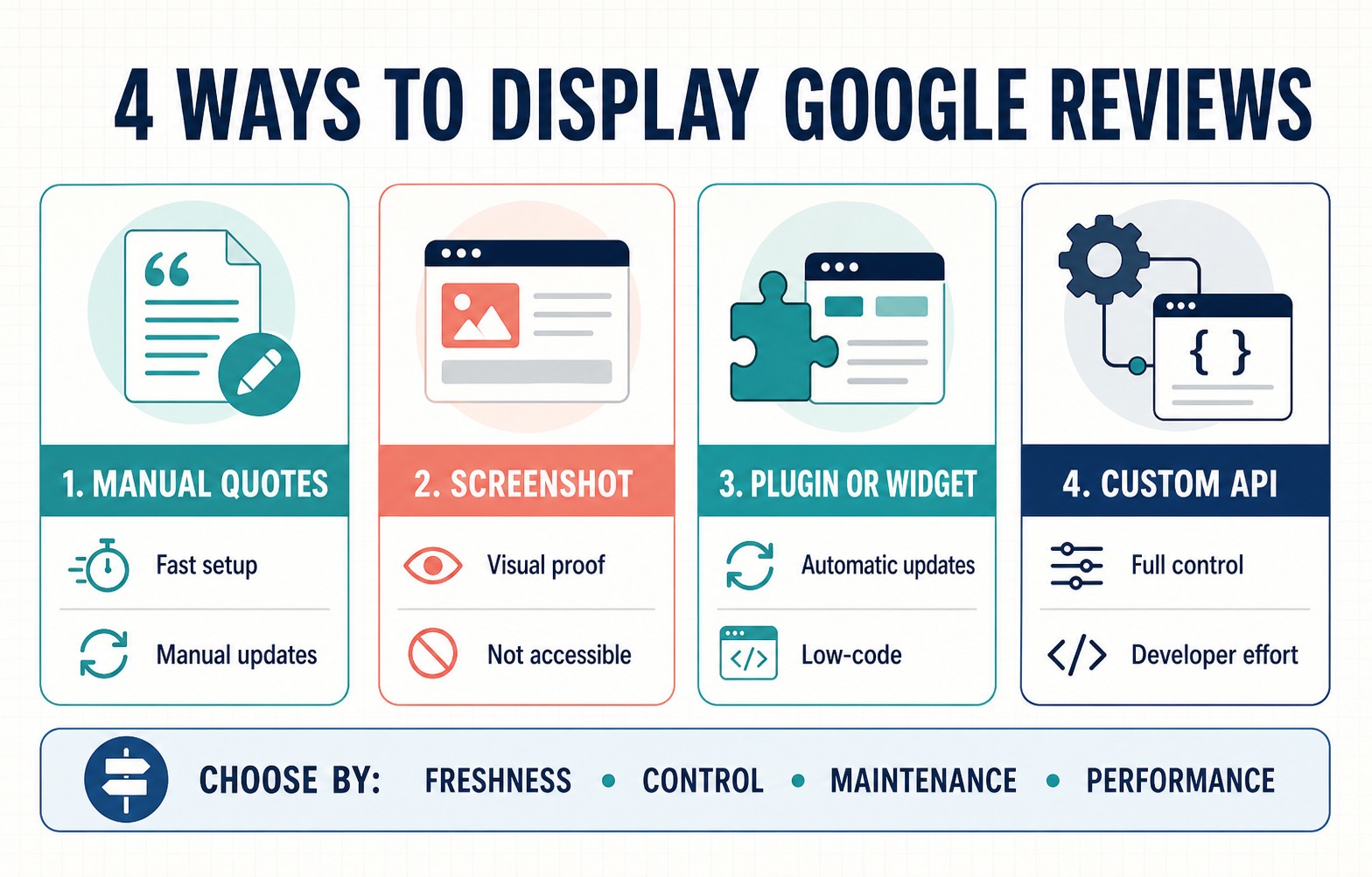
Four display methods compared by setup effort, freshness, control, maintenance and performance.
1. Add selected reviews manually
The simplest method is to create an ordinary testimonial block and enter selected review text, the reviewer’s displayed name, the rating, the date and a source link. This works in virtually every content management system because it does not require an external script or API.
Manual entry has real advantages. It gives the publisher precise control over layout, typography and which review supports each page. The review text is part of the page’s HTML, so it can remain readable if an external service is temporarily unavailable. A small, well-designed block can also be lighter than a third-party embed.
The weakness is maintenance. A rating summary can become inaccurate as new reviews arrive, an old quote can look stale, and copied text can drift away from its source. Manual curation can also become misleading if only unusually enthusiastic comments are selected while every reservation is hidden.
If using this method:
- Copy the review accurately; do not “improve” its wording or grammar in a way that changes the meaning.
- Show the rating, reviewer name as publicly displayed, review date and Google as the source.
- Link to the original review or the business’s review listing where practical.
- Record the date on which the overall rating and review count were checked.
- Schedule a recurring review of the page—monthly for a busy location or quarterly for a lower-volume business.
Manual blocks are a good fit for a small website that needs only a few carefully matched testimonials and has an owner or editor willing to maintain them.
2. Use screenshots sparingly
A screenshot can preserve the recognisable context of a review and can be inserted wherever the website accepts images. It may be useful inside a case study, a presentation-style page or a temporary campaign where the visual proof itself matters.
As a primary website solution, however, screenshots have serious limitations. The review text cannot resize naturally, search or translation tools cannot handle it as normal text, and screen-reader users need an equivalent text alternative. Small type that looks fine on a desktop image may become unreadable on a phone. Screenshots also become stale and cannot update their rating or date.
The W3C guidance on non-text content says meaningful information presented visually needs a text alternative that serves the same purpose. For a review screenshot, a short alt attribute may not be enough if the image contains a full paragraph. Put the review in adjacent HTML text or provide a suitable longer description, rather than attempting to cram every word into alt text.
Screenshots are therefore best treated as supporting evidence, not the foundation of a review display. Crop out irrelevant interface elements, keep the reviewer information that establishes provenance, obtain appropriate permission where necessary, add an equivalent text version, and link to the source.
3. Install a plugin or review widget
A plugin or hosted widget is usually the most accessible route for a team that wants automated updates without building an integration. The provider handles data retrieval and supplies a block, shortcode or embed that can be placed on selected pages.
The main benefits are speed and repeatability. One configured component can appear on a homepage, service page and location page; new reviews can flow through automatically; and non-technical editors can often change the layout or filters from a dashboard.
The trade-offs are dependency and performance. The website relies on another service, and its script, fonts, images or network requests can add page weight. Some widgets offer many decorative controls but too little control over semantics, keyboard navigation or loading behaviour. Others filter reviews in ways that are not obvious to visitors.
Before choosing a provider, check:
- whether the source, reviewer and date are clearly attributed;
- whether each review can link back to its source;
- how often data refreshes and what happens if the service is unavailable;
- whether filtering rules are visible and can be configured responsibly;
- whether the display is usable with a keyboard and screen reader;
- how it behaves at narrow mobile widths and with long review text;
- whether it reserves space while loading and supports delayed or lazy loading;
- whether styling can match the website without sacrificing legibility; and
- what data the script collects from visitors.
A widget is a strong fit for small and medium-sized organisations that value automatic updates and simple publishing more than complete control over the data pipeline.
4. Build a custom API integration
A custom integration offers the greatest control. A developer can decide how reviews are retrieved, stored where permitted, selected, rendered, cached, measured and refreshed. The result can match an established design system and avoid shipping features the website does not use.
It is also the method with the highest technical and compliance burden. Google’s Places API and Business Profile APIs serve different purposes and have different access requirements. The Business Profile reviews endpoint, for example, is for a specified verified location, requires authorisation, and can return paginated review data. The Places API place resource can return a maximum of five reviews, sorted by relevance. A developer should not assume that one public endpoint provides an unrestricted, permanent copy of every review.
Google’s current Places API attribution policies require author attribution and direct access to the source review on Google Maps. They also restrict storage of Places content and call for a clear explanation of how reviews are ordered or filtered. Requirements can change, so the implementation should be checked against the applicable product terms rather than copied from an old tutorial.
A custom integration makes sense when a business has multiple locations, an in-house development team, strict design or performance requirements, or a broader review-management product. For a five-page brochure site, it may create more long-term work than value.
A quick method-selection guide
| Requirement | Manual quotes | Screenshot | Plugin or widget | Custom API |
| Fast initial setup | Good | Good | Good | Poor |
| Automatic freshness | Poor | Poor | Good | Good |
| Design control | Good | Limited | Varies | Excellent |
| Accessibility potential | Good if built well | Poor without text equivalent | Varies | Excellent if built well |
| Ongoing technical effort | Low to moderate | Low to moderate | Low | High |
| Suitable for many locations | Poor | Poor | Good | Excellent |
| Platform independence | Excellent | Excellent | Good | Good |
For many local-business websites, the practical choice is between a small manual block and a reputable widget. Choose manual curation when only a handful of contextual quotes are needed. Choose a widget when freshness, reuse and low editorial maintenance matter. Reserve a custom integration for cases with requirements that justify ongoing development.
What should a trustworthy review card contain?
A review card should answer four questions without making the visitor work for them:
- What did the customer say? Preserve the substance of the original review. If a long review is shortened, use an ellipsis and make the full version available.
- Who said it? Use the reviewer name or identifier as it appears at the source. Do not invent surnames, job titles or customer details.
- When was it said? A visible date helps people judge freshness. “Two months ago” is more useful than an undated quote.
- Where can it be verified? Label the platform and provide a source link where the method permits it.
An overall rating can add context, but it needs a visible scale and an accurate review count: “4.8 out of 5, based on 126 Google reviews” is clearer than five icons floating without explanation. If the number is copied manually, include an internal “checked on” date in the publishing workflow so it is not forgotten.
Business replies can add value when they demonstrate how a concern was resolved or show that feedback receives a human response. Do not crowd every card with a generic thank-you. Use replies selectively where they help a reader understand the service.
Select reviews for relevance, not just praise
The most persuasive review is often the one that answers the concern a visitor has at that point in the page.
On a delivery page, a comment about arriving on time is stronger than a generic “Great company.” On a complex service page, a review describing the process and outcome is more useful than a star rating alone. Near pricing, a customer explaining value or durability can address the question that naturally arises there.
Create a simple review taxonomy based on real buying concerns:
- result or outcome;
- reliability and punctuality;
- communication;
- ease of use;
- value;
- support after purchase;
- suitability for a particular customer type; and
- location- or service-specific experience.
Then match reviews to pages using those categories. Avoid rewriting a review to manufacture relevance. If a quote does not support the claim beside it, choose another quote or change the claim.
Balance matters too. A perfect-looking wall of vague five-star comments can feel less believable than a smaller set of specific experiences. Google’s Maps policy says review contributions should reflect genuine experiences and prohibits paid or otherwise manipulated ratings. Its fake-engagement rules cover reviews that are not based on a real experience and reviews paid for directly or in kind. A website display should never disguise incentives, merge comments from different people, or present invented copy as customer feedback.
Put reviews where a decision is being made
Reviews are most useful near uncertainty. That usually means placing them beside a meaningful decision rather than collecting every testimonial in a distant “Reviews” page.
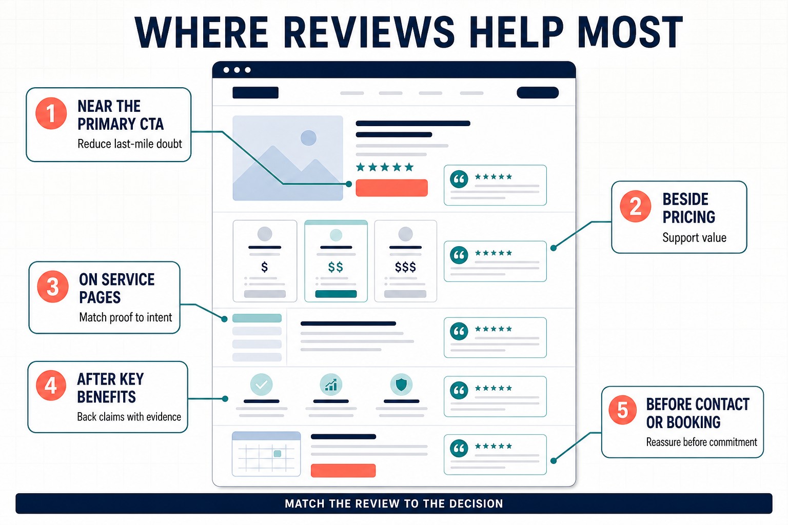
High-value placements connect the evidence in a review with the decision a visitor is making.
Near the primary call to action
A compact rating summary and one short, relevant quote can reduce last-minute doubt beside “Book an appointment,” “Start a trial” or “Request a quote.” Keep the hierarchy clear: the review supports the action but should not compete with it.
Beside pricing or packages
At this point, visitors are assessing risk and value. Use reviews that mention durability, results, transparent fees or the quality of ongoing support. Avoid claims that imply every customer will achieve the same result.
On service and location pages
Choose reviews that name the service, problem or place covered by the page. This is more informative for the visitor and prevents one generic feed from appearing identically across dozens of URLs.
After important benefit claims
If the page promises easy setup, responsive support or fast delivery, follow the explanation with a customer experience that independently illustrates that benefit. The review should corroborate the claim, not replace the explanation.
Before contact, checkout or booking
Commitment creates a final moment of uncertainty. A concise reassurance block here can work well, especially when it addresses cancellation, communication, delivery or what happens next.
A dedicated reviews page can still be useful for people who want to explore more evidence. Treat it as a deeper layer, then place smaller contextual selections on the pages where people actually make decisions.
Choose a display pattern that fits the amount of evidence
The interface should reflect the job the reviews need to do.
Rating summary: Best for a header, hero or CTA area. Show the numerical rating, scale, review count, source and the date or refresh status where appropriate.
Two or three review cards: Best for service pages and landing pages. Visitors can compare a few specific experiences without losing the page’s main thread.
Horizontal carousel: Useful when space is tight, but it needs visible controls, sensible swipe behaviour, pause controls if it advances automatically, and full keyboard operation. Important evidence should not exist only on a hidden slide. The W3C’s keyboard-accessibility guidance is a good baseline: all functionality should be available from a keyboard.
Filterable review wall: Appropriate for many services or locations when filters help visitors find relevant experiences. Explain the filter and ordering logic, and provide a useful default rather than forcing interaction.
Single contextual quote: Often the best option next to a specific benefit. A detailed sentence that addresses the claim can outperform a large generic feed.
Nine best practices that protect trust and usability
1. Preserve authenticity
Use genuine review content and retain its meaning. Correcting an obvious typo may appear harmless, but repeated polishing can make every customer sound like the same copywriter. If an edit is necessary for length, make the omission transparent and link to the full source.
2. Make the source unmistakable
Do not style a private email testimonial so that it looks like a Google review. Label the platform accurately. When Google data is retrieved through an API, follow the relevant attribution, source-link and branding requirements.
3. Avoid unexplained positive-only filtering
A business does not have to display every review on every page, but selection should have a legitimate editorial purpose such as recency, service relevance or location. If a feed is filtered, explain the rule in plain language. “Selected recent reviews mentioning installation” is more transparent than silently suppressing every review below five stars.
4. Design for reading, not decoration
Use normal text sizes, sufficient colour contrast, comfortable line lengths and a clear boundary between separate reviews. Star icons need a text equivalent such as “Rated 4 out of 5.” Do not rely on colour alone to communicate the score.
5. Make interactive displays accessible
Carousel arrows, filters and “Read more” controls need descriptive labels, visible focus states and keyboard support. Review text that expands should remain in a logical reading order. Test the component at 200% zoom and with text enlarged; long names and translated reviews should not break the layout.
6. Protect mobile usability
Do not shrink a desktop row of three cards until the copy is unreadable. Stack cards, reduce the number initially shown or use a controlled horizontal pattern. Keep touch targets large enough, prevent text from being clipped and avoid a review wall that pushes the page’s main action several screens away.
7. Control performance and layout shift
Third-party embeds can delay rendering or move content after the page appears. Reserve an appropriate area for the component before it loads, avoid unnecessary fonts and animations, and consider loading a large review wall only as it approaches the viewport. Google’s Core Web Vitals guidance identifies loading performance, responsiveness and visual stability as important parts of real-world page experience. Its recommended target for Cumulative Layout Shift is below 0.1.
The practical rule is simple: the page should remain understandable and usable while the reviews are loading—or if they fail to load at all. A fixed-height skeleton, a server-rendered rating summary or a graceful text fallback can all help.
8. Keep dates and totals current
An automatically synchronised display still needs monitoring. Check that the source connection works, the location is correct and the latest reviews appear as expected. For manual displays, add a maintenance owner and review date to the editorial calendar.
9. Link the display to reputation management
Publishing reviews is only the visible end of a larger process. Monitor new feedback, route operational complaints to the right team, reply appropriately and look for repeated themes. If customers repeatedly praise a feature, that insight can improve product messaging. If they repeatedly mention a delay or confusing handover, the website should not be used to hide the problem; the business process needs attention.
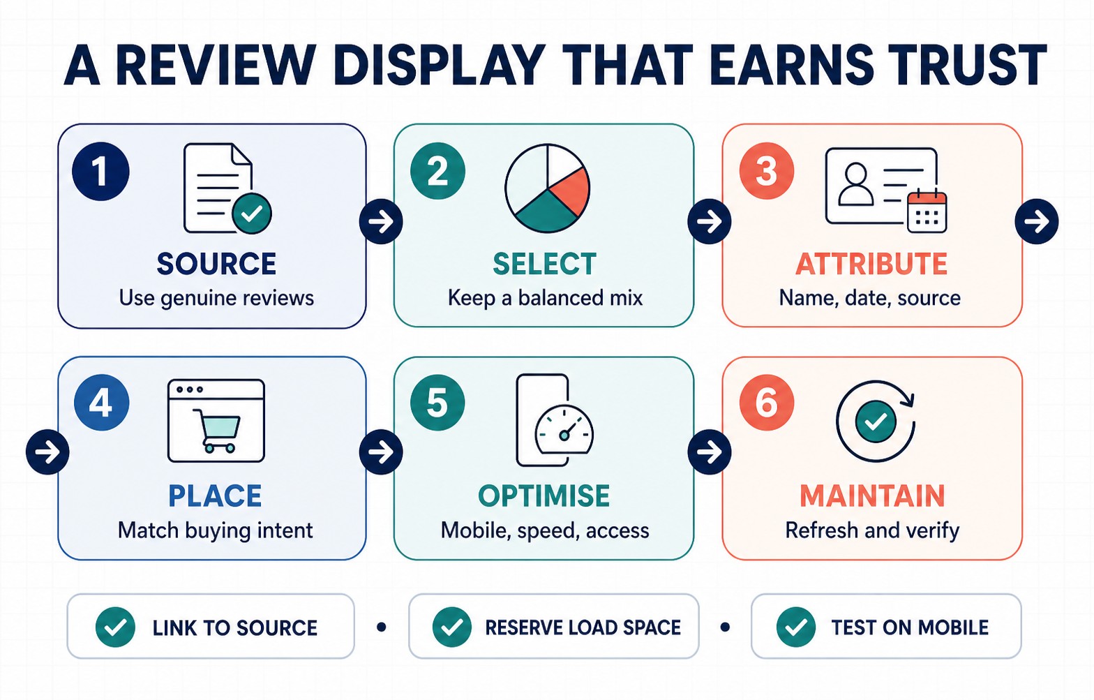
A reliable review display is a maintained workflow, not a one-time design element.
WordPress.com and WordPress implementation notes
On WordPress, the method determines how the review display is added. Manual review cards can be built from standard Group, Columns, Quote, Image and Button blocks. A plugin may provide its own block or shortcode. A hosted widget typically supplies HTML containing an iframe or script.
WordPress.com’s Custom HTML block guide explains an important platform limitation: ordinary HTML tags are available across plans, but interactive third-party widgets that depend on restricted elements such as iframe or script require a paid plan with hosting features activated. If code disappears after saving, check the plan and supported tags before assuming the widget itself is broken.
For a review section that should appear on many pages, use a reusable pattern, synced pattern or template part where the site setup supports it. Do not paste separate copies everywhere unless each page intentionally uses different reviews; duplicated embeds are harder to update and can multiply third-party requests.
After publishing, test the public page rather than relying only on the editor preview. Check a narrow phone viewport, a slow connection, keyboard navigation, long review text and the empty or failed-loading state.
What displaying reviews will—and will not—do for SEO
Useful review content can improve a page for human visitors by answering questions, adding specific language and strengthening trust. Those benefits are reason enough to design the section well. It should not be treated as a shortcut to review stars in organic search.
Google Search Central’s review-snippet documentation states that LocalBusiness and Organization review rich results are for sites that capture reviews about other businesses. Reviews about a business placed on that same business’s website are considered self-serving for this purpose, including when they arrive through a third-party widget. Adding AggregateRating markup to a local business’s own Google review display therefore does not make the page eligible for those review-star rich results.
That rule does not mean reviews must be hidden from the website. It means publishers should separate two ideas:
- Visible social proof for visitors: often useful when authentic, relevant and well presented.
- Review structured data for search features: subject to specific eligibility and content guidelines.
Avoid vendors that promise guaranteed organic star snippets from self-serving local-business reviews. Structured data should accurately describe eligible page content, and no markup can guarantee a particular search appearance.
Measure whether the review display helps
Do not judge the component only by how polished it looks. Decide what behaviour it should influence and measure that outcome.
Useful events can include:
- clicks from a review to its Google source;
- expansion of a long review;
- interaction with a service or location filter;
- movement from the review section to a booking, checkout or enquiry step;
- completed enquiries or purchases after the review section was viewed; and
- component load failures or unusually slow load times.
Interpret these signals carefully. A low click rate on “View on Google” does not prove the reviews are ineffective; the visible evidence may already have answered the visitor’s question. Combine analytics with usability tests, customer interviews and session-level observations where lawful and appropriate.
For a high-traffic page, test one meaningful change at a time: contextual reviews versus generic reviews, two cards versus a carousel, or placement near the CTA versus a separate section. Keep the source and overall page offer consistent so the result is interpretable.
Pre-publish checklist
Before a review display goes live, confirm the following:
- Every review is genuine and accurately represented.
- Reviewer, date, rating and source are clear.
- Source links and platform attribution work.
- Any selection or filtering rule has a legitimate purpose and is explained where needed.
- The chosen reviews match the page and the nearby customer decision.
- Rating summaries include the scale, count and current value.
- The component works at narrow mobile widths and with long text.
- All controls work with a keyboard and have visible focus states.
- Review screenshots or other informative images have equivalent text.
- Space is reserved to prevent layout shift while dynamic content loads.
- The page remains useful if the third-party service fails.
- Scripts, network requests and privacy implications have been reviewed.
- Self-serving local-business reviews are not marked up in pursuit of review rich results.
- Someone owns the refresh, monitoring and response process.
Frequently asked questions
Can Google reviews be embedded directly from Google Maps?
Google Maps does not provide a universal copy-and-paste review widget for every ordinary website use case. Businesses generally use manual curation, a third-party widget or an approved API integration. The correct method depends on the platform, required features and applicable Google terms.
How many reviews should a page show?
Use the smallest number that answers the visitor’s question. One strong contextual quote may be enough beside a service benefit; two or three cards often work well near a decision point; a dedicated review page can offer a broader set. More reviews add value only when they provide new information rather than repeating the same praise.
Should only five-star reviews be displayed?
Not by default. Reviews should be chosen for relevance, specificity and freshness. A balanced set is usually more credible than a feed that silently excludes every less-than-perfect experience. If a filter is applied, make its purpose clear.
Should a website include a “Leave a review” button?
It can, particularly on post-purchase or customer-support pages intended for existing customers. Keep it separate from the evidence shown to prospects, link to the official review flow, and never offer payment, discounts or gifts in exchange for positive feedback. Google’s Business Profile guidance explicitly prohibits incentives offered in exchange for posting, changing or removing reviews.
How often should a review section be updated?
Automatic displays should be monitored regularly even if they refresh in the background. Manual selections should be checked on a schedule appropriate to review volume—monthly for an active location is a reasonable starting point. Replace stale examples when newer reviews provide stronger or more relevant detail.
Final principle: help the visitor verify the promise
The best review display is not the one with the most stars, the largest carousel or the busiest animation. It is the one that helps a visitor verify a relevant promise at the moment they are deciding whether to act.
Start with the decision, select genuine evidence that speaks to it, preserve the source and context, then choose the lightest display method that can remain accurate. When the implementation is accessible, fast and routinely maintained, Google reviews become more than decoration: they become useful information in the customer’s decision-making process.